
Dracula
book illustration

the project
Wraithmarked Creative trusted me with their deluxe edition of Dracula by Bram Stoker. I was responsible for the cover & dust jacket art, illustrated endpapers & chapter headers, as well as interior artworks. Creative direction carried out by Eira Brand.
It's hard to overestimate the cultural impact Bram Stoker had on popular media, sparking creation of numerous books, movies, games and music. Approaching a title of such significance is always a challenge - a welcome one nonetheless.
Over the course of this project I had the pleasure to prepare over a dozen illustrations, allowing me to look at this timeless classic horror through a contemporary lens - and a traditional medium.
Once all of the illustrations have been finished and prepared for printing - Shawn T. King's design brought the novel together. The book featured high-end offset printing, a smyth-sewn binding, and metallic gilding of the page edges - as well as a full-wrap dust jacket and a printed case.

the brief
Since the brief focused heavily on the moment in which Dracula turns into dust, I decided to lean into the movement of particles picked up by the wind, and fill the page with sinewy streaks of his desintegrating form.
I was aware, however, that this transformation would surely require rendering at least some of the internal anatomy - and seeking inspiration for the angle of the frame led me to a human skull model I keep at hand and utilize often as a convenient reference.
That's also when I realized that the negative space between the mandible, the maxilla and zygomatic arches creates a vague bat shape. And that partiuclar observation became the foundation for further work on the composition.
In order to move away from strictly human anatomy, I decided to modify the dentition to fit a vampire, including pronounced canines and sharpened lateral incisors for grasping prey - I also proposed a bat-inspired nasal structure, as it offers a bit more striking visual.

the thumbnail
In order to hint the novel's era I also included a shirt's collar with a cravat/ascot, with blood streaks staining the fabric. Dracula's expression would remain smug and confident, wearing an uncomfortable grin even in the face of imminent doom.
Following the aforementioned decisions - and including my signature stylization for the count's deep-set eyes - I prepared a 3x4 inch thumbnail sketch - which served as a basis for further discussion about my ideas and potential changes from the creative direction.
Though this particular artwork was initially meant to decorate one of the endpapers, the aesthetic value it offered justified turning it into a cover instead. After confirming the safe zones required for the lettering and adjusting the layout to the new role, the composition has been approved for development in full size.
Eventually, once the page count was established to calculate the spine's width, the margins were also extended to accomodate for the recently updated cover dimensions:
1/3 work in progress image for a book cover artwork for the Wraithmarked edition of Bram Stoker's Dracula. Illustrated with archival ink on A4 acid-free paper. Commercial project. © 2024 vvilczy. All Rights Reserved.
2/3 work in progress image for a book cover artwork for the Wraithmarked edition of Bram Stoker's Dracula. Illustrated with archival ink on A4 acid-free paper. Commercial project. © 2024 vvilczy. All Rights Reserved.
the layout
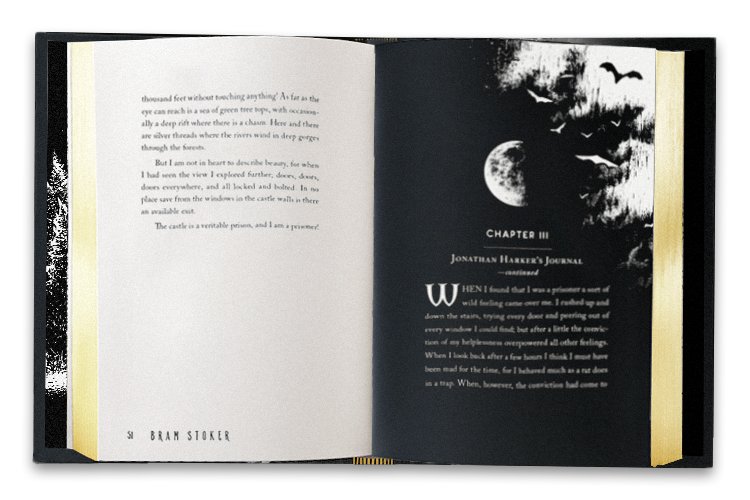
Beyond creative direction, Eira Brand has also been tasked with preparing the book's layout. Chapter headers weren't initially included in the illustration count - but with a publication of this calibre - I offered something suitable for the occasion. Aware of the significance of the nocturnal themes and the symbolism of the moon - I opted for a conceptual approach.
Dracula is an epistolary novel, constructed through documents, notes and letters - almost all of which are dated. Having the opportunity to determine the exact moon phase through the year, for this purpose 1893, I decided to illustrate each of the moon phases and suggested assigning them to the dates mentioned in the chapters - and this was the final result:

selected interior illustrations
Interior artwork for the Wraithmarked edition of Bram Stoker's Dracula. Illustrated with archival ink on A4 acid-free paper. Commercial project. © 2024 vvilczy. All Rights Reserved.
Interior artwork for the Wraithmarked edition of Bram Stoker's Dracula. Illustrated with archival ink on A4 acid-free paper. Commercial project. © 2024 vvilczy. All Rights Reserved.
Interior artwork for the Wraithmarked edition of Bram Stoker's Dracula. Illustrated with archival ink on A4 acid-free paper. Commercial project. © 2024 vvilczy. All Rights Reserved.
Interior artwork for the Wraithmarked edition of Bram Stoker's Dracula. Illustrated with archival ink on A4 acid-free paper. Commercial project. © 2024 vvilczy. All Rights Reserved.
Interior artwork for the Wraithmarked edition of Bram Stoker's Dracula. Illustrated with archival ink on A4 acid-free paper. Commercial project. © 2024 vvilczy. All Rights Reserved.
Interior artwork for the Wraithmarked edition of Bram Stoker's Dracula. Illustrated with archival ink on A4 acid-free paper. Commercial project. © 2024 vvilczy. All Rights Reserved.